

How to Make Your Landing Pages Super Good for Selling Stuff
Hey there! You know when you click on a link because you're curious about something cool to buy, and it takes you to a page that tells you all about it? That's a landing page. And if you're helping to sell products for other companies, which is called affiliate marketing, you want your landing page to be awesome so lots of people buy stuff. So, let's talk about how to make your landing page super amazing for selling a whole bunch.
Make It Super Clear What You're Selling
First off, when someone lands on your page, you want them to know right away what you've got for them. If you're selling a toy, show a picture of kids playing with that toy and having loads of fun. If it's a book, share a picture of someone reading and looking super interested. Make sure the words on your page, which we call “copy,” explain what's so cool about the product in a way that's easy to understand.
Make It All About Them
Guess what? People love to know how something will make their life better. So, tell them how that toy will make their kids super happy, or how that book will make them feel smart or excited. It's like saying, “Hey, this thing I'm talking about is going to be your new best friend.”
Be Like a Friend, Not a Salesperson
You know how it feels when a friend tells you about something awesome? You trust them, right? That's the feeling you want on your landing page. Write like you're talking to a friend. Be cool, be friendly, and be real. It's like saying, “I found something great, and I just HAD to tell you about it.”
Show That Other People Love It Too
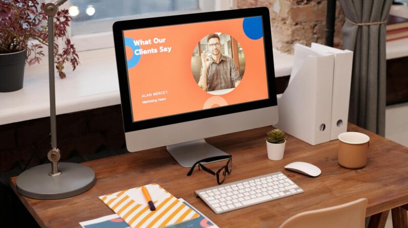
When lots of people like something, it makes it easier for us to like it too, right? So on your landing page, show that other people think this product is great. This could be through stars that show how many people rated it (like four out of five stars), or even just some nice things that people said about it. This helps new visitors think, “Hey, if others are happy, maybe I'll be happy too.”
Give Them a Nudge to Buy
Sometimes people need a little push to buy something. This could be a special deal, like “buy one, get one free,” or maybe a discount if they buy it soon, like “20% off just for today!” It's like saying, “This deal is too good to miss, so you should probably grab it now.”
Make It Super Easy to Buy
Do you like it when things are easy? So does everyone else. If they have decided they want to buy the thing, don't make them click a million times or fill out long forms. Just have a big, bright button that says “BUY NOW” or “GET YOURS” that takes them straight to where they can get it. The quicker it is, the more people will do it.
Test and Change Things Up
You know how sometimes what works today might not work tomorrow? That's why you've got to keep trying new things. Maybe try different pictures or different words to see what makes more people buy. It's like trying different toppings on a pizza until you find the tastiest one.
Remember, make your landing page clear, talk to people like they're your friends, show them the love other people have for the product, offer them cool deals, and make it super easy for them to buy. These steps should help you sell a lot of stuff as an affiliate. And always keep testing, because you never know what little change might make a big difference.
Keep It Fresh and Fun
Last tip, but still super important: Keep your landing page feeling new and exciting. Update it with the latest info about your products, and maybe add new pictures or fun facts now and then. This helps people who come back to your page see that there's always something good happening, and it might just be the thing that helps them decide to buy.
Alright, you're all set! Now go out there and make your landing page so good that everyone will want to buy what you're sharing. Keep it simple, keep it real, and have fun with it! Good luck!
What are the absolute must-haves for a successful affiliate marketing landing page?
For a killer affiliate marketing landing page, clarity is king. You need a catchy headline that hooks visitors and a compelling call-to-action (CTA) that screams “click me”. High-quality images or videos showing the product in action can work wonders, too.
Also crucial are trust signals, like testimonials or trust badges. They give your page credibility. And don't forget mobile optimization—tons of folks shop on their phones, so if your page isn't mobile-friendly, you're missing out big time.
How do you make sure your affiliate landing page loads super fast?
Nobody likes waiting, right? Speed up your loading time by compressing images and using web-optimized formats like JPG or WebP. Also, clean up any bloated code and use a content delivery network (CDN) to serve up your content quick-smart.
Beyond that, reducing redirects and minimizing the use of heavy plugins can make a huge difference. Check your page's speed with tools like Google's PageSpeed Insights and tweak as necessary. Keep things lean and mean for the best results!
Can tweaking the headline really boost conversions on my affiliate landing page?
You bet it can! Think of your headline as the first—and possibly last—chance to grab someone's attention. A magnetic headline that nails the visitor's pain points or desires can make 'em stick around and read more.
Experiment with different headlines and measure how they perform. A/B testing can help you hit the sweet spot that gets visitors fired up and ready to snag what you're promoting.
What's the deal with A/B testing on affiliate marketing landing pages?
A/B testing is like your secret weapon for optimizing your landing page. Create two versions of your page (A and B, duh!) with just one change between them, say, the CTA button color or the headline.
Then, you send half your traffic to each and watch the results. Which one gets you more clicks or sales? That's your winner! Keep testing different elements to fine-tune your page to perfection.
How often should I update my affiliate marketing landing page?
Keep your landing page fresh but don't tinker with it just for the sake of change. If your conversion rates are dipping or you've got new product features to shout about, that's the time for an update.
Also, if there's a season change or a major holiday around the corner, tap into that! Update your page to match the mood and potentially see a nice uptick in conversions.
Key Takeaways
- Crush it with clear, concise headlines that grab attention and instantly clarify the offer's value – hook 'em fast!
- Keep your design sleek and straightforward – no messy distractions, just a smooth path to the CTA (Call To Action).
- Testimonials aren’t just fluff, they’re trust-boosters. Flaunt those raving reviews to build credibility.
- Highlight benefits, not just features – tell visitors how your product will rock their world.
- Get personal with your copy, speak directly to your visitor's pains and dreams – make it about them.
- Strong CTAs are non-negotiable – make 'em bold, make 'em bright, and make 'em beg to be clicked.
- Optimization is an ongoing party – keep A/B testing to find what makes your audience tick, click, and stick around.
- Mobile-friendly isn't a nice-to-have; it's a must-have – your landing page has got to be flawless on phones and tablets.
- Faster load times equal happier visitors – keep your page lean for speed and watch bounce rates drop.
- Seamlessly integrate relevant keywords but don't overstuff – stay smooth, stay relevant, keep it flowing.
- Lever your analytics like a pro – know what's working, tweak what isn't, and always aim to outdo your last win.
- Don't forget the power of social proof – sprinkle social shares, likes, and follower counts to show popularity and acceptance.
- Remember, it's about creating an irresistible journey from the headline to the CTA – that's your roadmap to those explosive affiliate sales!
Final Thoughts
Alright, so cranking up those affiliate sales means giving your landing pages a serious tune-up. Focus on making them clear and engaging, with headlines that stick like gum on a shoe. Load time matters, too; keep it snappy, or you'll lose eyes faster than a sneeze in a windstorm.
Visual appeal is king, but don't let the bling overshadow your call-to-action—make that baby shine! And please, oh please, keep the mobile crowd in your corner. More folks browse on their phones than ever, so if your page is a pinch-and-zoom nightmare, you're toast.
Remember, A/B testing is your BFF in this game. Mix, match, and see what sticks. It's like finding the secret sauce for your burger – except this sauce can seriously fatten up your wallet. Keep testing, keep tweaking, and watch those sales numbers explode like fireworks on the Fourth of July.