

Let's Make Awesome Banners for Affiliate Marketing
Hey there, friends! So you know when you're online and you see those flashy pictures or banners that make you wanna click on them and see what's up? Yeah, those are called affiliate marketing banners. And they're like little online billboards that can make people wanna buy stuff. But how do we make sure our banners are the kind that people want to click? Let's figure it out together!
Why Banners Matter
Banners are powerful because they're like the shiny hooks that catch the fish in the big internet ocean. They grab your eyes and if they're done right, they make you curious enough to bite. I mean, click. So, we gotta design banners that not only look cool but also make people really want to check out what we're offering.
Keep It Simple and Clear
First off, simplify! Too much stuff on your banner is like a messy room; nobody knows where to look. Keep your designs clean and easy to look at. Just use a few simple words that tell folks exactly what they'll get. Like, “Super Comfy Sneakers” or “Cook Like a Pro.” And always use big, bold letters so they can't miss it.
Colors That Pop
Colors are like the seasonings in your grandma's secret soup recipe; they can make or break your banner. Use bright and cheerful colors to get attention, but not so many that it looks like a unicorn's birthday party. And remember to choose colors that go well with the thing you're selling. You don't want to use muddy brown on a banner for sparkly nail polish, right?
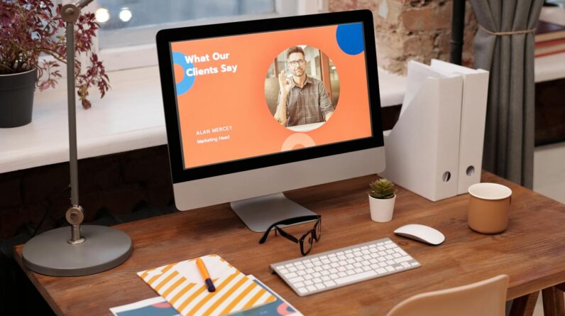
Pictures That Tell a Story
Next, let's talk pictures. A picture can tell a whole story without saying a word. Use images that show off the product you want people to buy. If it's a book, why not show someone really enjoying reading it? If you're selling a game, how about a picture of friends having a blast playing it? Make sure the photos are super clear and look professional. It's like when you make your bed in the morning; it just looks better!
Make ‘Em an Offer They Can't Refuse
Now, about your offers. Offers are like the cherry on top of a sundae. Maybe you can tell people they’ll get a discount, like “20% Off Today Only.” Or you could give them something extra for free, like “Buy One, Get One Free.” Just make sure your offer is really tempting and that it shines like a treasure on your banner so everyone can see it.
Action Words to the Rescue
Action words, or call-to-action (CTA) words, are like when your mom says “clean your room,” and you know you gotta do it right now. Your banner should have strong action words that make people want to act quickly. Try “Buy Now,” “Get Yours,” or “Join Today.” These words should be on a button or in a spot that stands out so people know where to click. It's like marking the spot on a treasure map where the gold is hidden.
Test and Learn
Before you finish, remember to always test your banners. Testing is like when you try different flavors of ice cream to find the one you like best. Try putting your banner up and see if people click it. If not many people do, it's okay to try changing the colors, the words, or the pictures. Eventually, you'll find a mix that works like magic.
Don't Forget Mobile Users
Lastly, in today’s world, many people use their phones more than computers to check stuff out online. So you need to make sure your banners look good on smartphones too. It's like making sure your shoes fit well both for school and for running around in the playground.
Alright, that's a wrap on making banners that can really help sell stuff! Remember, keep it simple, use cool colors, pick the right pictures, give people an offer they can’t ignore, and use action words to help them click. After that, test your banner to see if it works and always make sure it looks good on phones. Now, get out there and make some awesome banners!
What colors work best for affiliate marketing banners?
Choosing the right colors for your affiliate marketing banner can make a big difference. Vibrant and contrasting colors tend to attract attention, but make sure they align with the brand you're promoting. Try to use a color scheme that pops against the background of where the banner will be displayed.
Also consider color psychology. For example, red can evoke urgency, while blue builds trust. Pick colors that reflect the emotions you want to evoke in your potential customers. But remember, the banner should be pleasant to look at. A color clash can be off-putting.
Should words or images be the focus of affiliate marketing banners?
This depends on the product or service you're promoting. If it's visually appealing or demonstrable, use high-quality images to grab attention. People often react positively to images before reading text. However, if your offer requires explanation or has a strong unique selling proposition, highlight that with compelling text.
You should balance words and images, ensuring neither overwhelms the other. Consider using a powerful headline paired with a striking image that supports the message. Text should be concise and easy to read — this isn't the place for lengthy descriptions.
What size should affiliate marketing banners be?
The banner size will depend on where you intend to place it. Common sizes include 728x90px for leaderboards, 300x250px for medium rectangles, and 160x600px for skyscrapers. Check where your banner will go and design it to fit perfectly. Most importantly, it should be responsive to look good on different devices.
Check the platform's guidelines you're going to use for their recommended sizes. This ensures the banner won't be too large, causing slow loading times, or too small, making it difficult to see. Also, remember mobile users — a rapidly increasing audience for affiliate marketing.
How can I ensure my affiliate banner is clickable?
A clickable banner is all about the call to action (CTA). Make your CTA button or text large enough to notice, but not overpowering. Use action words like ‘Buy Now', ‘Get Started', or ‘Learn More' to encourage clicks. Place the CTA in a prominent position that naturally draws the eye.
Additionally, make sure your banner design isn't too cluttered. A clear, simple design usually works best for guiding viewers right to your CTA. Plus, ensure that the landing page linked to the banner aligns with the banner's message for a seamless user experience.
Is it important to change affiliate marketing banners regularly?
Yes, updating your affiliate marketing banners is essential to keep your campaign fresh and engaging. The same banner can become mundane over time, leading to what's known as ‘banner blindness', where viewers ignore your ads. Try introducing new designs periodically to recapture attention.
Seasonal updates are also a great way to stay relevant and boost engagement. For example, using holiday-themed banners can make your offer more appealing during specific times of the year. Just ensure that each design stays true to the product and the brand's voice.
Key Takeaways
- Keep it simple: Clutter-free designs work best. Stick to minimal text and visuals to deliver a clear message.
- Powerful imagery: Use high-quality, relevant images that draw the eye and complement your message.
- Compelling copy: Write concise, action-oriented copy. Use persuasive language to encourage clicks.
- Consistent branding: Align your banners with your brand colors and style to build recognition and trust.
- Clear CTA: Design a standout call-to-action button. Make it pop with contrasting colors or an eye-catching design.
- Test for performance: A/B test different designs to see what resonates with your audience and drives conversions.
- Optimize for mobile: Ensure your banners look great and function well on all devices, especially on mobile screens.
- Understand the platform: Tailor your banner design to meet the requirements and best practices of the platform it'll be displayed on.
- Use incentives: Highlight exclusive offers or discounts to motivate users to click through.
- Analytics matter: Track metrics like click-through rate (CTR) to measure effectiveness and make informed design adjustments.
Final Thoughts
Alright, let's wrap this up. Crafting affiliate marketing banners that really pop and work their magic is all about nailing that visual and message combo. Make sure your graphics grab attention without being too in-your-face. You want a clear, compelling call-to-action that’s like saying, “Hey, click me!”
Be smart with colors and contrast. Aim for the kind that makes your banner impossible to ignore but still easy on the eyes. Balance is key here. And don't forget those banners need to load at lightning speed. No one's waiting around for a slow poke to load.
Finally, keep it fresh. Update your designs regularly and A/B test them to see what's resonating with your audience. Because guess what? What worked last month might not cut it now. Stay on top of trends, but always stay true to what your audience digs. Keep these points in mind and you're on your way to designing affiliate banners that will turn browsers into buyers.